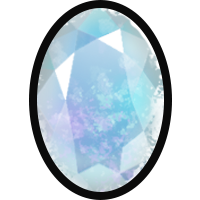
The current size previews don't allow us to see vital details. I cannot tell you how many times I've clicked on a seemingly perfect Lorwolf only to find out it has colours that I don't want or are incompatible with my goals.
I have started to zoom my browser up to 150% to see better. Even just a quick hover option would be nice. Or even an option to preview the market as icons rather than a list (but it would still include the details below the pic).
Does anyone else feel the same, or is this just a me problem?


